
I’ve been bashing on updating this site’s design for the last couple of weeks. It’s high time things get a fresh coat of paint, right? The last version of CSS-Tricks was pushed five years ago. That’s ancient in web (and dog) years.
It’s not like the site has simply sat all that time. We pushed lots of changes and shipped new features, particularly since 2024, but we never really got the paint brushes out of storage.
Now, before there’s a chorus of “things don’t look thaaaat different” I want to say I’m rarely a fan of complete re-builds and tend to lean into iterative releases. And the new v20 theme is what I’d call an iterative rollup that’s worthy of a version bump.
Let’s go over the most notable updates to see why.
Excavating Ghosts
First and foremost, some of the biggest changes are what you don’t see. As you might imagine, this site has carried over plenty of pieces across 19 years. I decided to excavate the theme and definitely found some ghosts to bust.
For example, the global compiled JavaScript file retained some scripts that just weren’t being used anymore. Things like handling embedded versions of the newsletter from before we began self-hosting the posts. There were relics that catered specifically to the Flexbox Guide for handling toggles back before we had proper HTML <details>. There was a jQuery lazy-loader thing that is well-covered by WordPress core now. We had some scripts for serving third-party ads that are no longer needed now that we’re self-hosting ads. Things like that. The overall JavaScript was nicely trimmed from 151.6 KB (55.3 KB gzipped) to 133.8 KB (48.1 KB).
I also decided to formally retire the CSS-Tricks Forum. We put it in “archive mode” back in, like, 2018. None of those discussions are particularly valuable for today as they were over 10 years ago, so I deactivated the bbPress plugin that powered it and cleared out the database… and wow, that carved a whopping 400 MB from the ol’ database, not to mention it allowed me to drop several custom templates from the theme.
There were more ghosts busted along the way and, to be sure, there are still some lurking around. But it’s way less scary poking around the theme directory now, and further cleanup should be a lot easier from here on out.
Modern Dev Tooling
Yeah, yeah, raise your hand if you’re still running Gulp. We are 🙋♂️. That’s not a bad thing in and of itself, but keeping it in a fixed state for all this time is not the greatest. I think we’re sporting a more modern workflow than before, even if there’s still room to grow. A smattering of the related commits:
- Prettier enforced via husky + lint-staged pre-commit hook
- Stylelint added for alphabetical CSS property order
- GitHub Actions build check added
- Cache-busting switched from rewriting source files to
filemtime()
For years, I endured the same errors every time I fired up a new terminal. Those are gone and things run super cleanly, not to mention quickly. Very happy here.
Security Pass
Oof, this is everyone’s favorite job, right?! Aside from being able to spot and fix a few unescaped custom field calls here and there, I decided to ask Claude to help me with a holistic audit. I prompted it to review recent WordPress security release notes and identify areas where the theme could be hardened to comply with what WordPress is doing.
Whoa, you used AI? Yeah, I sure did. But for things like this where it could be my little gopher and allow me more time to do what I do best: front-end. I’m still able to make most of the patches myself based on the output recommendations, but it’s nice to have a gut-check for things where I’m clearly no expert, like security.
Sass Rewrite
I still use and like Sass very much. I mean, yes, I would like to be straight-up vanilla CSS everywhere, but I can’t tear myself away from partials in particular.
The previous theme had a fairly nice “flat” structure — very few partial directories and most things all in the same top-level source. Totally cool. But an organization nut like me (you should see my house) has to have a place for everything to live. It ain’t perfect, but I’m happy with what I was able to put together without leveling the building in the process.
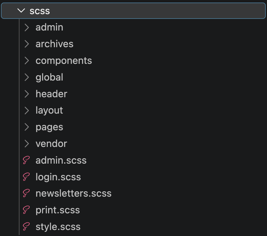
There are some compromises. Like, /header should really be in /layout. The ordering is really important, though, and some of my ideals were simply not possible. I’m hoping to eventually work in some sort of Cascade Layers structure.
I’m pleased as punch to see the overall size of CSS drop in the process. It went from 180 KB (31.7 KB) to 169 KB (24.6 KB). Not hugely significant, but not not significant either. I had to do a couple tricky things to cheat my way there, like serving all the form styles I’m about to talk about into a separate forms.css file and serving it just on pages where WooCommerce, Restrict Content Pro, and Gravity Forms are enqueued.
A Sort-of Design System
Are you starting to notice a trend? We’re still talking about fairly invisible work. CSS-Tricks has so many nooks and crannies that it’s nearly impossible to make things perfectly consistent across the board. But because of those nooks and crannies, so many fixed values, magic numbers, one-off styles, and older utilities were hiding about. I decided to tackle a good chunk of that while reorganizing the Sass.
For example, there are now semantic design tokens that abstract away one-off colors. So many grays, let me tell you. Now there’s a maintainable palette that’s referenced throughout. Same with fonts, font styles, and font sizes. Same with paddings and margins. It feels a lot better to make a change at the “system” level with confidence that the change is taking effect everywhere it needs to.
But this is also where some clearly visible changes happened! Most notably, link styles are consistent all over the place with a small handful of intended and maintained variations. Not only is it more pleasing visually, but it improves accessibility throughout because the inherited styles default to proper visual cues that do not rely solely on color or opacity changes.
Oh, and my favorite piece of this? Forms and tables have both been redone. That’s tough to do in a WordPress theme where these components don’t always come from one source. For example, forms could come from any one of the Gravity Forms, WooCommerce, or Restrict Content Pro plugins, and they all have their own stylesheets. Resetting those allowed me to bring a certain level of harmony in all those instances.
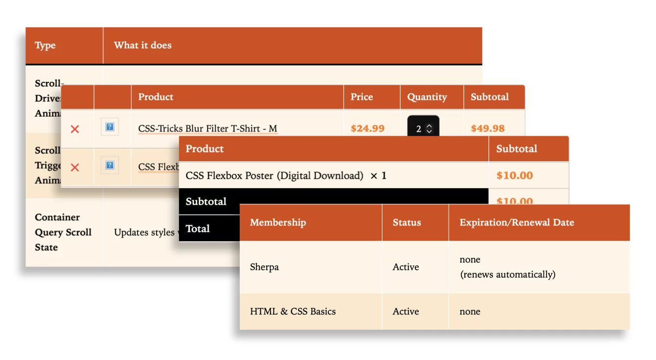
Tables are a perfect example of how component styles line up throughout version 20.
Theme Toggle
OK, something even more visual. This is the first time CSS-Tricks has had more than one color scheme! It certainly could have been done a long time ago, but I’d also argue that the design hasn’t really called for a light/dark toggle over the last 8 years or so. It’s a nice blend of both light and dark elements that marry the best of both worlds no matter your theme preference.
But I had to take a stab, right? The site has predominantly been dark despite the content being against a white background, so I treated things as though a “dark” mode already existed. The result is a creamy light theme that is largely just a change in background and component styles. And I used some of what I learned from the recent “toggle” debate to handle system, dark, and light themes with a single toggle.
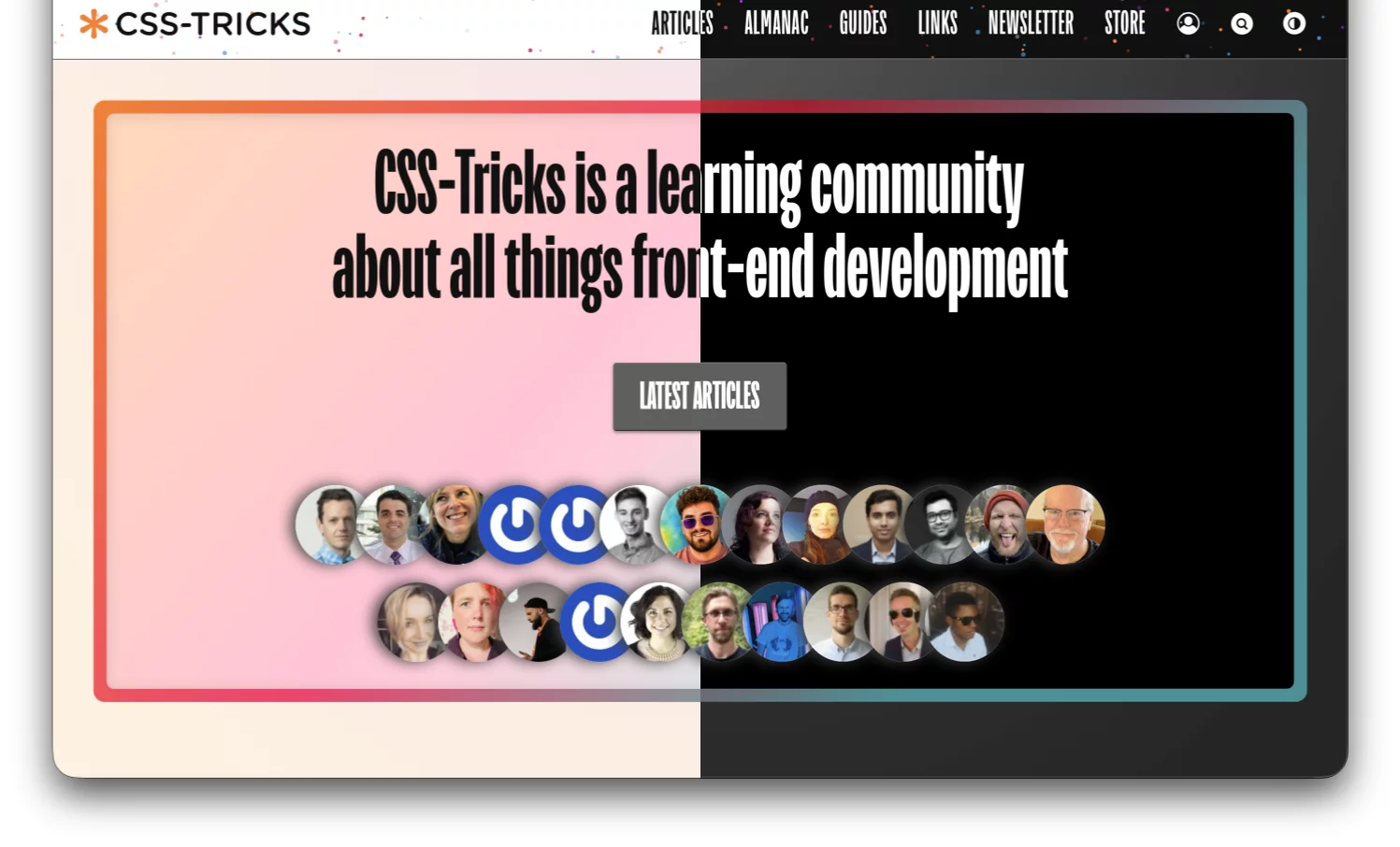
What hasn’t changed is the main content container you see in things like articles. That was already white, even in a “dark” mode, and I’m not confident that simply toggling it between white and black is the best approach. Something on the radar for sure.
Oh, and it’s all wired up to a view transition that slides the new theme over the previous one. Watch the theme toggle in action.
Jawbreaker Texture
I hope you think the site’s header and footer are cute. Yes, cute. That’s what I was going for when adding a colorful series of dots as the backdrop.

Sorta like a subtle candy texture, right? Or a colorful group of stars? I dunno, but I’m calling it “Jawbreaker” for lack of a better term and because it reminds me of the jawbreaker candy I loved as a kid. Naming still sucks.
It’s all part of the same SVG. I really, really (really) wanted to random()-ly position dots around, but that would have taken a lot of empty individual elements (e.g., <i>) in the markup, which felt like too much clutter for a purely decorative effect. A single SVG keeps things light while still delivering the candy-colored charm.
That’s a tour of the most notable changes in version 20. Much of the work happened under the hood, but together the cleanup, tooling, design tokens, and new visuals give the site a fresher, more maintainable foundation to keep iterating on.