The strongest visual concepts don’t start in Figma. They start with the right questions. This article explores the pre-concept phase of brand identity design, where teams research brand context, uncover hidden assumptions with stakeholders, and turn shared direction into a visual foundation before a single concept is created.
When a branding project fails, it usually happens long before the logo stage: in the strategy phase, when words like “modern,” “trustworthy,” “premium,” “friendly,” and “disruptive” are left undefined. The result is a gap between what the brand is supposed to communicate and what the designer is expected to create. This is the space I like to call the “pre-concept” phase.
At the beginning of a project, designers usually receive many inputs: a brief, a few stakeholder conversations, competitor references, maybe a moodboard or a list of adjectives. From there, they are expected to create visual concepts that feel right. But “right” is difficult to judge when the team has not agreed on what the brand is supposed to communicate in the first place.
As an example, a health tech company we worked with said they wanted to look modern, trustworthy, and disruptive. At first, “disruptive” sounded like a push toward something bold and unconventional. But as we talked, it became clear that disruption, for them, still had to feel credible inside a conservative healthcare environment. Their clients were large government medical institutions. A brand that felt too rebellious, experimental, or visually loud would not create the right kind of trust.
In other words, their version of “disruptive” looked more traditional than the word suggested.
The problem was not that the client used the wrong language. The problem was that the language was too broad to guide design decisions. Before a designer can turn strategy into a visual concept, those words need to become more specific. What kind of modern? Trustworthy in what way? Disruptive compared to whom? And how far can the brand move away from category expectations before it starts to feel wrong for its audience?
This article is about that pre-concept phase: the work that happens after the kickoff but before the first visual direction. While the broader brand identity process for digital products includes strategy, concepts, implementation, and the assets a product team needs to build consistently, this article focuses on the earlier work that makes the first concept possible: researching the brand context, uncovering hidden assumptions with stakeholders, and turning shared direction into a visual foundation. It is a practical bridge between what the brand needs to mean and how it might begin to look.
The first place to build that bridge is the brand workshop, where broad discovery needs to become a clearer understanding of the brand context.
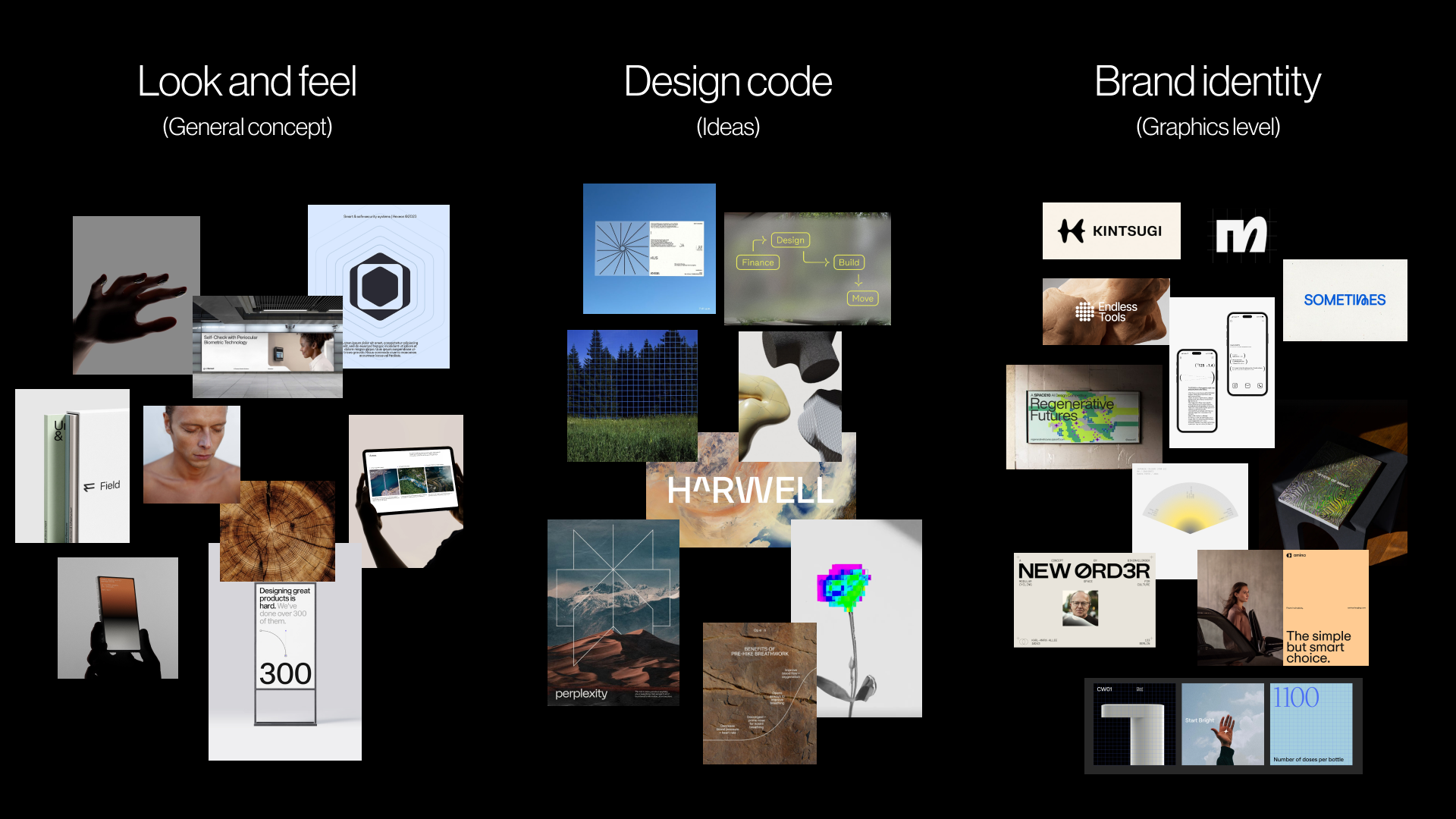
A pre-concept reference board showing how brand character can move from overall look and feel to design code and early brand identity cues. The board uses publicly available visual references to discuss mood, principles, and possible graphic directions before original concept work begins.
Stage 1: Research The Brand Context
A brand workshop will naturally cover the standard discovery topics: the business, its goals, the product or service, the competitive landscape, and the target audience. Here, I want to focus on a smaller set of questions that are easy to skip but extremely useful before visual work begins. These questions are less about collecting facts and more about clarifying perception. They help the team understand what the brand needs to make people believe, where it needs to feel credible, and which category assumptions it should follow or challenge.
For readers who want a broader starting point, we prepared a Brand Workshop Toolkit: Questions and Exercises, a FigJam framework we use in our studio to structure discovery conversations.
Perception sits at the center of brand discovery because the brand is shaped in someone else’s mind.
“A brand is a person’s gut feeling about a product, service, or company.” — Marty Neumeier, The Brand Gap
If the brand ultimately lives in someone else’s perception, the workshop has to clarify what perception the team is trying to create.
The perception questions I focus on are:
- What should people believe about the company after seeing the brand for the first time?
- What would make the brand feel credible in this category?
- If the brand were a person in the room, how would they speak?
- What do customers currently misunderstand about the company, product, or category?
- Where does the brand need to fit the category, and where does it need to break from it?
These questions help reveal the assumptions behind people’s opinions, instead of simply adding more opinions to the room. The questions matter because brand attributes often sound aligned before they are actually understood. A stakeholder may say the brand should feel “premium,” and everyone may nod. But one person may mean refined and editorial. Another may mean expensive and exclusive. Another may mean clean, quiet, and minimal. The word sounds shared, but it can lead to three completely different visual systems.
For instance, in the health tech project mentioned earlier, the client described the desired brand as “disruptive.” In many categories, that might suggest something bold, loud, or unconventional. But their audience was large government medical institutions, so disruption had to be expressed through clarity, efficiency, and confidence rather than rebellion. If we had taken the word at face value, the visual direction could easily have moved too far from what their audience would trust.
In another project, a fintech team wanted the brand to feel “bold” without losing credibility. That word created useful tension. Bold could mean bright colors, oversized typography, and a highly expressive system. But in a financial category, it also had to carry signals of security, control, and competence. The question was not whether the brand should be bold, but what kind of boldness would still feel trustworthy.
When the team can define what these attributes mean in context, the designer is no longer working from broad adjectives. They are working from a clearer design problem.
Strategically selected questions can uncover part of the verbal layer, but words alone are rarely enough. To move from language into visual direction, it helps to incorporate exercises that make stakeholders think through images, associations, and relative perception.
Jake Knapp makes a similar point in GV’s Three-Hour Brand Sprint:
“The point of these exercises is to make the abstract idea of ‘our brand’ into something concrete.” — Jake Knapp
The following two exercises help translate what stakeholders say about the brand into material that can later inform look and feel, design principles, and concept development.
This is also where stakeholder participation becomes important. When clients only receive a strategy presentation, they can stay passive. They may agree in the meeting without noticing the assumptions they are bringing into the process. But when they have to place a competitor on a map, choose an image, or explain why a certain reference feels credible, they become active participants. Their attitudes, beliefs, and disagreements become visible before they have a chance to derail the first concept review.
I usually start by looking outward at the category, then inward at the brand itself.
Exercise 1: Competitor Perception Mapping
Before the workshop, collect screenshots of competitor brands, websites, product interfaces, social visuals, or other visible brand touchpoints. During the workshop, ask the client team to place those competitors on a simple two-axis map.
This exercise is not about deciding which competitors have “good” or “bad” design. It is about understanding how the client reads the category: what feels credible, what feels generic, what feels too conservative, what feels too experimental, and where there may be an open visual territory for the brand.
The axes should be chosen based on the tension the brand needs to solve. For example:
- Traditional to progressive
- Corporate to human
- Understated to bold
- Accessible to exclusive
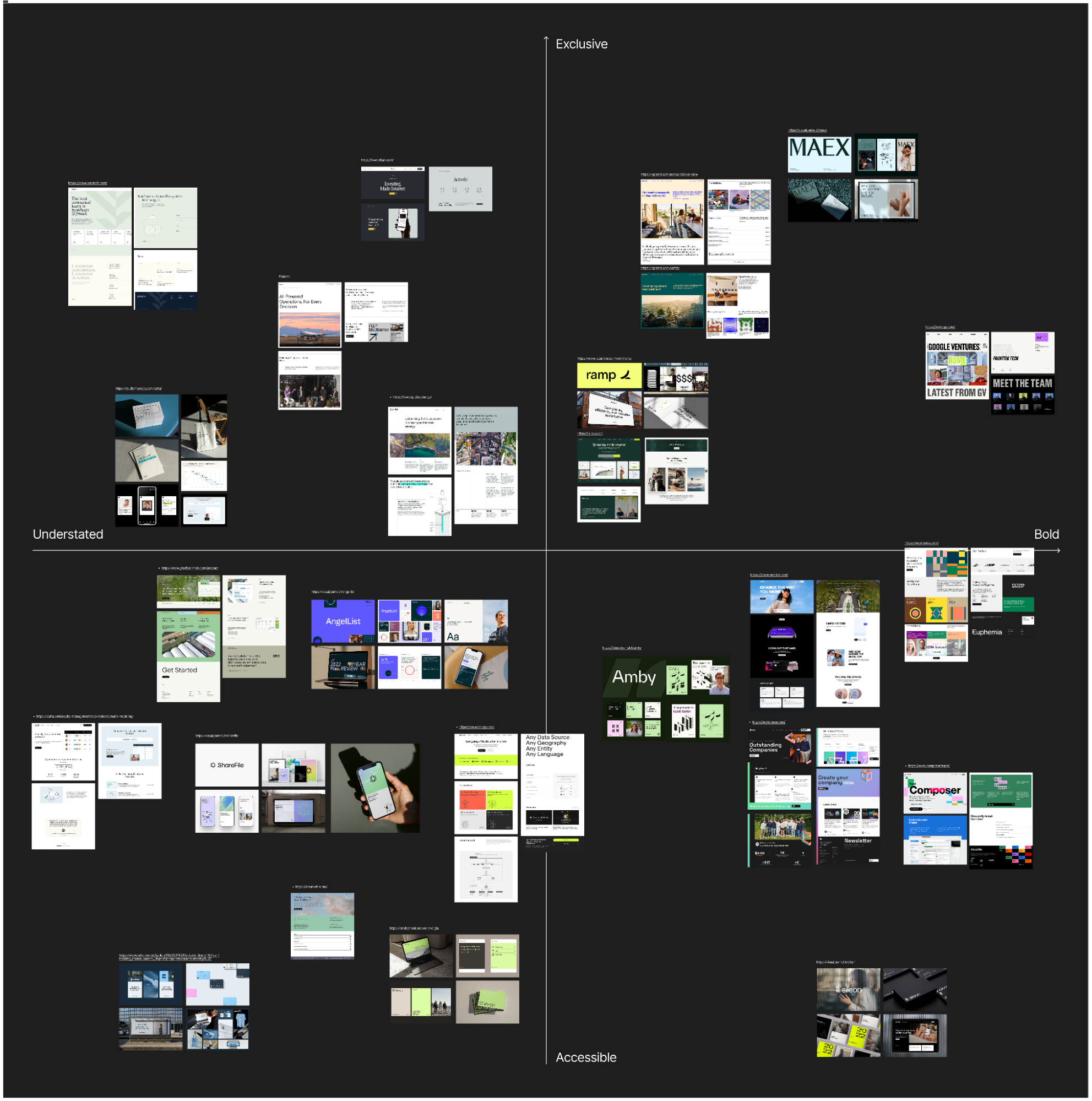
The map’s value is not the final placement of competitors — it is the conversation that happens while placing them. When two stakeholders disagree on where a competitor belongs, that disagreement usually reveals something important about how the team thinks about the brand’s own position. Those moments of friction are worth noting, because they often point to the exact tension the visual direction will need to resolve.