We’ve fallen into conversational tunnel vision, defaulting every AI capability into a chat-based interface simply because LLMs are trained on dialogue data. But great UX is about matching modality to users’ context, intent, and cognitive load — so the interface adapts to the user, not the other way around.
The design community has entered a period of conversational tunnel vision. Because Large Language Models (LLMs) are trained on dialogue, the industry has collectively decided that the chat bubble is the natural home for every AI capability. While the chat interface is a viable and powerful option for many tasks, it is one tool in an expansive toolkit. UX and Product teams must be intentional about the modalities we choose for how users provide their data and commands, and how the system presents its output.
Modality is the way a person uses their senses to interact with a system: seeing, hearing, touching, speaking, or typing.
To pick the best method, you need to think about what the user wants to do, where they are, and how much cognitive effort they are already expending. This guide offers a clear way to figure out the best approach for any product, using two tools to assist in the process: a Task Audit and an Input/Output Alignment Matrix.
Picture a traveler jogging through a loud airport terminal after a sudden gate change. They are dragging their roller bag and carrying a coffee in the other hand. They need to open their airline app to ask the AI assistant where to go. The tool immediately fails the input modality test. It forces the traveler to stop walking, balance their coffee, and type a long booking reference number into a tiny chat box. When they finally hit send, the system fails the output modality test. Instead of flashing a large, high-contrast gate number, the AI returns a dense paragraph explaining the atmospheric weather patterns causing the delay. The actual gate number sits buried at the very bottom.
While they might make the flight just fine, the user won’t forget the moment of anxiety they felt while using the AI tool — an experience that could have served as a way to reinforce a commitment to UX has instead validated the common conception that companies don’t care about or understand customers using their products. In this scenario, the airline built a smart tool, but the interface failed the user. The input required physical dexterity, which the traveler lacked at the time of need. The output demanded a level of reading focus they could not spare. This article will cover how we can avoid this scenario in our AI-powered tools. In order to be successful, we must evaluate the physical and cognitive load of our users to match both the input and output modality to their immediate intent.
Myth of the Do-It-All Chatbot
The allure of the chatbot is easy to understand from a product development standpoint. It is a blank slate. It suggests that the system can handle anything the user provides. However, a text-heavy interface often causes a high adaptation load. This load increases cognitive demands on users. Over time, this cognitive burden turns into a psychological tax a person pays when changing natural thought processes to accommodate a machine.
When an interface relies solely on conversation, it imposes a dual burden: a linguistic challenge for input and a cognitive challenge for output. We’ll examine both separately below.
Input: Why a Text Box Is a Linguistic Barrier
A blank chat box creates a major problem for users who need to discover what a tool can actually do. In a standard graphical interface, menus and buttons provide clear visual cues that signal every available option. A chat box often leads to choice paralysis because users are forced to guess what the AI is capable of. They have to remember the exact phrasing or technical terms required to get the result they want.
Consider a data analyst who wants to find a specific trend in a spreadsheet. In a traditional tool, they might click a filter or sort button. In a chat interface, they must suddenly become a writer and describe that complex logic in a complete sentence. Another example: a manager trying to reorganize a team schedule. Dragging and dropping blocks on a calendar is intuitive. Describing those same scheduling shifts in a text prompt adds a layer of work that makes the task feel more difficult than it should be.
Designing for input means recognizing that composing a prompt is a creative act. It requires a person to translate a vague thought into a specific command. For many professionals, this creates a linguistic barrier. A designer might know exactly how they want an image to look but struggle to describe the lighting or texture in a text prompt. In that case, a slider or a color picker is a much better input method than a text box.
Output: The Cognitive Cost of Reading Long Text
When an AI responds in long blocks of text, it transfers the interpretive work to the user. Text is a serial medium: your brain has to read one word after the next to extract meaning. That takes time. Sequential reading is necessary in many scenarios — complex legal analysis or reviewing nuanced medical histories requires reading full paragraphs. Teams create friction when they default to text for data that visual formats communicate faster. Visual methods allow parallel processing. You can view a chart and spot a pattern in under a second.
Imagine asking an AI for a project status update. Instead of a color-coded dashboard, you receive three paragraphs listing every task completed that week. Now you must read the entire response and mentally summarize it to find the one piece of information you needed. The quick visual check has been replaced by a reading assignment.
The cognitive tax of this work compounds with professional stakes. A doctor asking for a patient’s vital signs needs a clear numerical display, not a narrative describing the readings. A stock trader looking for a price spike needs a line graph immediately, not a written description of price movement over the past hour. In both cases, a text response forces the professional through a slow, error-prone extraction process when speed and accuracy are most important.
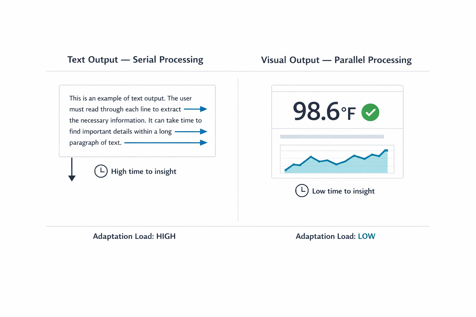
Figure 1: Redesigning for psychological fatigue. The linear text loop (left) forces exhausting sequential verification, causing anxiety. The graphical selection grid (right) permits instant, low-effort visual confirmation (glance verification).
A Taxonomy of Input and Output Modalities
Before selecting a modality, practitioners need a shared vocabulary for what the options actually are. The table below maps common input and output modalities to the contexts where each performs best. This is not a ranking. Each modality has a role; the question is always which role it is playing in a given workflow.
Designing for modality inherently requires a strong focus on accessibility. While visual dashboards provide rapid insight for many people, designers need to provide screen-reader-optimized audio alternatives for users with visual disabilities. Modality choices should multiply pathways to information.
Input Modalities
| Modality | Best For | Example Contexts | Cognitive & Physical Rationale |
|---|---|---|---|
| Button / Tap | Single-step, binary actions | Launching a feature; confirming an alert | Eliminates recall overhead by utilizing recognition; maximizes execution speed during time-sensitive tasks. |
| Voice | Hands-busy or eyes-busy contexts | Field technician query; driving navigation | Offloads physical interaction to speech, though bounded by ambient noise and social privacy norms. |
| Natural Language Chat | Ambiguous or exploratory queries | Researching options; asking follow-up questions | Offers users freedom in what they can say; however, the user must figure out how to phrase their request clearly. |
| Form / Wizard | Structured, multi-field data entry | Filling out a contract; configuring a report | Keeps users from missing information by breaking down a complicated task into clear, step-by-step visual sections. |
| GUI (Filters, Sliders, Drag-and-drop) | Complex parameter setting or spatial tasks | Scheduling; data filtering; image editing | Prevents mistakes and ensures users don’t miss information by dividing complicated tasks into clear, step-by-step visual parts. |
| Multi-modal (Image + Text) | Visual input paired with description | Uploading a design mockup with annotation | Reduces the linguistic burden of pure text input by letting users show rather than describe what they mean. |
Matching the right modality to the right task is not a one-time design decision — it is an ongoing practice of observing how users actually behave under real conditions of time pressure, physical constraint, and cognitive load. The goal is always the same: reduce the effort required to get from intent to outcome, so the interface serves the user rather than demanding the user serve the interface.